Dashboard
The Dashboard is the operations overview — a single screen that answers "is everything healthy, and what's happening today?".
Admin only. Regular users see a locked screen. The metrics here aggregate across all users and sessions, so they're scoped to operators.
Refresh
The header has a single Refresh button. The page does not auto-poll — every load and every click of Refresh re-fetches all six underlying endpoints in parallel:
/api/health— current provider/agent state./api/health/history?limit=5— last five health checks./api/providers— number of configured providers./api/stats/summary— token totals for today./api/tasks?status=running— count of running tasks./api/cronjobs— count of enabled cronjobs.
If any one of them fails, an error banner appears at the top of the page and the rest of the data still renders.
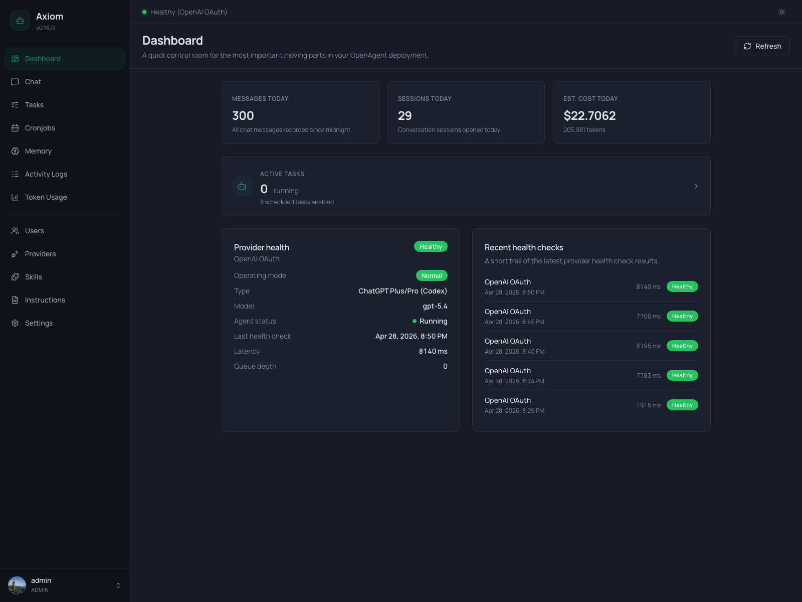
KPI row
Three cards sit at the top, each showing one number that resets at midnight (server timezone, see Settings → Agent):
| Card | Number |
|---|---|
| Messages today | Total chat messages recorded since 00:00 — both directions. |
| Sessions today | Number of distinct conversation sessions opened today. |
| Est. cost today | Estimated USD cost based on tokenPriceTable from settings.json. |
The cost card additionally shows the underlying total token count below the value. If your provider isn't in tokenPriceTable, this number stays at $0.00 — see settings.json Reference for how to add prices.
Active Tasks card
A wide card below the KPI row links to the Tasks page. It shows:
- Running — how many tasks are currently in
runningstate. - Scheduled — how many cronjobs have
enabled = true.
Click anywhere on the card to jump to the Tasks list filtered to running tasks.
Provider health
The left half of the bottom row shows the active provider, its current health, and the agent process state. This card is only rendered when the Health Monitor is enabled (see Settings → Health Monitor — if you've turned it off, the whole bottom row disappears).
The card layout adapts to the current operating mode:
Normal mode
When the configured provider is healthy, you see:
- Operating mode —
Normal(green badge). - Provider type / Model — e.g.
OpenAI / gpt-5.1. - Agent status —
RunningorStopped. Dot turns green when running. - Last health check — timestamp of the most recent check.
- Latency — round-trip latency of that last check, in milliseconds.
- Queue depth — number of in-flight requests the agent is currently handling.
The status badge in the card header reflects the provider state: Healthy, Degraded, Down, or Unconfigured.
Fallback mode
When the primary provider is failing and the Health Monitor has switched over, three extra rows appear:
- Fallback provider — name and model that's currently answering.
- Primary provider — its last known health status (
Down,Degraded). - Recovery — "Recovery checks running…". The Health Monitor keeps probing the primary so it can switch back automatically.
The operating-mode badge turns amber so the fallback state is visible at a glance.
If the most recent health check produced an error message, it's shown in a red Alert at the bottom of the card.
Recent health checks
The right half of the bottom row lists the last five health checks (timestamp, provider, status, latency). New entries arrive on the next Refresh — there is no live tailing here. For a deeper history, jump to Activity Logs or look at the database directly.
If health monitoring has never run (e.g. fresh install), the list shows an empty state.
What's not on the Dashboard
A few things you might expect here live elsewhere:
- Per-provider cost breakdown → Token Usage.
- Tool call history → Activity Logs.
- Failed tasks → filter the Tasks page by status
Failed. - Memory state → Memory.
The Dashboard is intentionally a one-screen summary. Everything that needs scrolling, filtering, or editing has a dedicated page.
See also
- Settings → Health Monitor — check interval, fallback rules, notifications.
- Settings → Agent — active provider/model, language, timezone.
- Tasks — for the full task list behind the Active Tasks card.